Tutorial: plotting filtered electronic band structures #
In this tutorial, we show how to upload the results of your DFT band-structure files to DFT-Hub, select certain projections, and generate, customize, and export a band structure.
Upload the electronic band structure files #
The first step is to upload the required files from your DFT simulation.
The upload panel indicates which files can be provided.
Not all files are mandatory; however, the file that contains the band information
is essential (for example, PROCAR is required for a VASP simulation).
In this section, you are also asked to provide the Fermi energy. If the Fermi energy
is given, the plot will automatically shift the energies so that the Fermi level is set to zero.
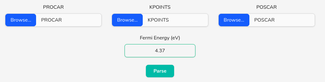
After selecting the files you can proceed by clicking on the Parse button.
Select filters/projections #
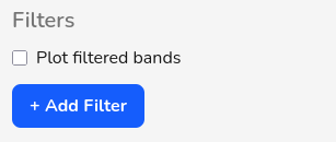
To plot a filtered electronic band structure, first add a filter by clicking the Add Filter button. This will automatically check the Plot filtered bands checkbox and uncheck Plot plain bands. If you also want to show the plain bands, re-enable the Plot plain bands checkbox. You can add multiple filters and overlay them in the same figure.
Each time you click the Add Filter button, a new filter panel is added where you can
specify the settings for that filter. You can remove any filter by clicking Remove.
When using multiple filters, make sure to select the same values for line width, marker size,
vmin, and vmax so the plots remain visually consistent.
Coloring scheme and dynamic width #
There are two coloring modes: colormap and solid color. You can switch between them using the radio buttons.
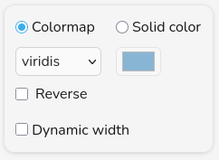
Colormap: selecting the colormap radio button activates the dropdown menu where you can choose a colormap from a searchable dropdown menu. A list of available colormaps can be found on the matplotlib website. You can reverse the direction of the colormap by checking the Reverse checkbox.
Solid color: selecting the solid color radio button activates the browser’s color picker. For this option to produce a meaningful visualization, it is recommended to enable Dynamic width by checking its checkbox.
Dynamic width: when dynamic width is enabled, the line width scales with the selected projection value. Thicker lines correspond to larger projection values.
Line and marker #
The Line and Marker panel controls the line style, line width, markers, and marker size.
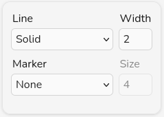
Line: use the dropdown menu to choose the line style (solid, dashed, dotted). You can remove the line completely by selecting none. This is useful when you want to display only markers and have Plot plain bands enabled.
Width: set the line width by entering a number (in pixels). If dynamic width is selected, this value is used as a multiplier.
Marker: choose a marker shape using the dropdown menu. The selected shape will appear at each sampled k-point along the band. You can remove markers by selecting none.
Size: set the marker size by entering a number (in pixels). If dynamic width is selected, this value is also used as a multiplier.
Vmin, Vmax, and opacity #
This panel controls the minimum and maximum projection values as well as the item opacity.
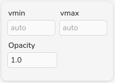
Vmin: set the minimum projection value that will be mapped to the lowest color, width, or size.
Vmax: set the maximum projection value that will be mapped to the lowest color, width, or size.
Opacity: set the opacity of item to any value between 0 and 1, where 0 means fully transparent and 1 means fully opaque.
Label and smoothing #
This panel controls the legend label and curve smoothing.
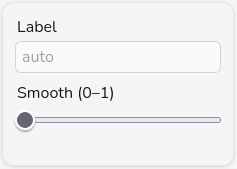
Label: set the legend label for this filter.
Smooth: select a smoothing value using the slider. Smoothing is applied using a Catmull-Rom spline. We recommend using smoothing only for exploratory plots and relying on a denser k-point sampling for publication-quality figures.
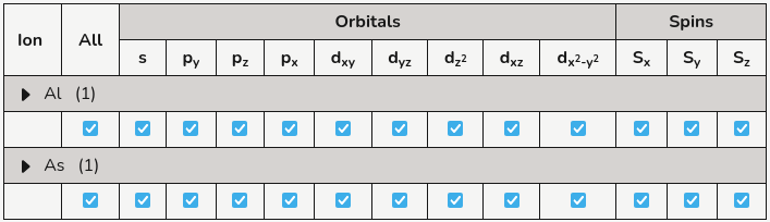
Selecting atomic, orbital, and spin filters #
Each time you add a filter, a table listing all atoms, orbitals, and spin channels (for non-collinear simulations) is added to the page so you can select any specific projection you need. By checking or unchecking each box, you include or exclude that selection from the filter, respectively.

You can access any atom by expanding the collapsible ▸ Ions button. If the files provided in the upload section contain information about the crystal structure (for example, a POSCAR file for VASP), the table will group atoms of the same species together and replace “Ion” with the species name in the collapsible button.
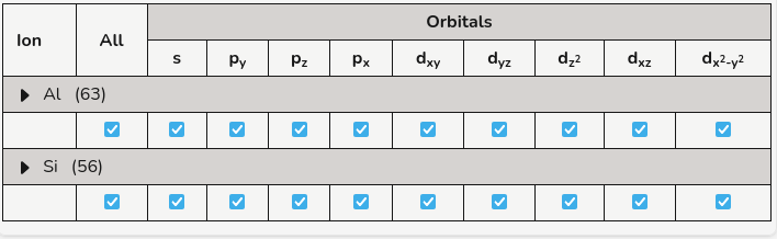
The first row for each species and the first column of the table can be used to apply changes to all entries in that row or column, respectively.
If the simulation is non-collinear, three additional columns for Sx, Sy, and Sz will be added.
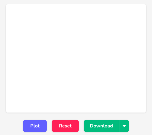
Plot and export the figure #
After uploading the input files and configuring the settings, the band structure can be visualized in the plot area. The central panel displays the band-structure plot, and the surrounding controls let you generate, clear, and download the figure.
To create the plot, click the Plot button. The band structure will be rendered in the chart area. If the plot is wider than the available space, you can scroll horizontally using the scroll bar beneath the figure to inspect different regions of the Brillouin zone.
If you want to clear the current figure and start over (for example, after changing the input files or settings), use the Reset button. This will remove the existing plot and return the plot area to its initial state.
The Download split button allows you to export the current band-structure plot as an image. Clicking the main Download button will save the figure using the default export option. By clicking the small arrow next to it, you open a menu where you can choose the desired format: PNG, JPEG, or SVG. This makes it easy to include the band-structure plot in presentations, reports, or publications.
Adjust the plot appearance #
The settings sidebar located at the right side of this webapp lets you fine-tune the appearance of the plot. Options are grouped into collapsible panels so you can focus on one aspect at a time (figure layout, titles, axes, grid, and so on).
Figure #
In the Figure panel you control the overall size and layout of the plot.
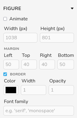
Animate: enable this option to animate transitions when the figure is updated.
Width and height: customize the size of the figure by setting the width and height in pixels. The initial values are chosen automatically based on your screen size and shown as placeholders.
Margin
Adjust the left, top, right, and bottom padding around the plot. This field accepts numbers and percentages. The unit for number values is pixels.
Border
Color: customize the border color using the color picker. The appearance of the color picker is defined by the browser. In Firefox, to select a custom color you need to click on the “+” icon.
Width: customize the border line width by modifying this field. The units are pixels.
Opacity: set the opacity of border to any value between 0 and 1, where 0 means fully transparent and 1 means fully opaque.
Font family: set the font family for the figure in this field. The selected font is applied to all text elements in the figure. You can use any font installed on your computer. If the font was not applied after selection, click on the Plot button one more time. When exporting the figure as an SVG, the font will only display correctly on other machines if that font is also installed there. To make the text appear consistently on any computer, you should convert the text to curves (outlines) using tools such as Adobe Illustrator or Inkscape.
Title #
The Title panel lets you add and style a main title for the band-structure figure.
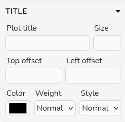
Plot Title: set the plot title using this box. You can use LaTeX formating for superscript and subcript using "_", "^", and "{}". You can also use greek alphabet using LaTeX formating (e.g. \alpha)
Size: set the font size of the plot title using this box.
Top and Left offset: customize the title position by modifying the top and left offset values.
Color: customize the title color using the color picker. The appearance of the color picker is defined by the browser. In Firefox, to select a custom color you need to click on the “+” icon.
Weight: customize the font weight using this dropdown. The options correspond to font-thin, font-extralight, font-light, font-normal, font-medium, font-semibold, font-bold, font-extrabold, and font-black, which map to 100, 200, 300, 400, 500, 600, 700, 800, and 900, respectively. Most fonts only provide a subset of these weights (typically normal and bold). You can see examples of fonts that support all weights in Google Fonts.
Style: customize the font style as normal or italic.
Limits #
In the Limits panel you can restrict the visible region of the plot.
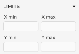
X min and X max: adjust the x-axis interval shown in the plot by setting the minimum and maximum in these fields. For electronic band-structure plots, you can provide the limits as integers that count segments of the k-path. For example, if the path is Γ–X–W–K–Γ–L–U and you select 1 and 4 for X min and X max, respectively, the plot will display the segment X–W–K–Γ.
Y min and Y max: adjust the y-axis interval shown in the plot by setting the minimum and maximum energy values in these fields.
Each axis also has its own zoom slider that can be adjusted using the mouse.

The edges of the zoom slider can be dragged to expand or contract the zoom window. You can also click and drag the center of the slider to move the fixed interval to a different region of the axis.
Lines #
The Lines panel controls the appearance of the plot lines for each spin channel. If a spin polarized simulation is uploaded, a second set of settings will be automatically added.
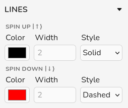
Color: customize the line color using the color picker. The appearance of the color picker is defined by the browser. In Firefox, to select a custom color you need to click on the “+” icon.
Width: customize the plot lines line width by modifying this field. The units are pixels.
Style: choose the line style for plot line using this dropdown. Available options are: solid, dashed, and dotted.
Fermi Level #
The Fermi level panel manages the horizontal line that marks the Fermi energy in the plot. You can enable or disable the Show fermi checkbox.
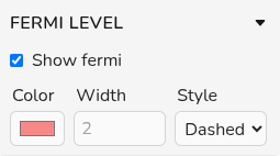
Color: customize the fermi line color using the color picker. The appearance of the color picker is defined by the browser. In Firefox, to select a custom color you need to click on the “+” icon.
Width: customize the fermi lines line width by modifying this field. The units are pixels.
Style: choose the line style for fermi line using this dropdown. Available options are: solid, dashed, and dotted.
x-Axis #
The X Axis panel lets you configure the axis label and tick marks. You can toggle the label visibility using the Show label checkbox.
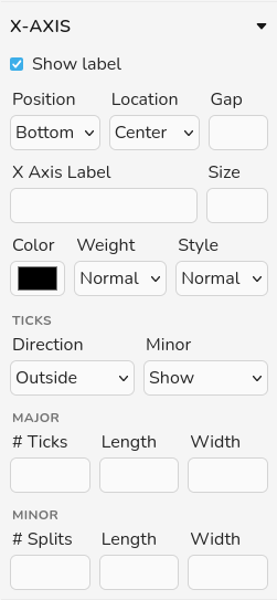
Position: choose where the axis label is placed relative to the chart. The available positions for x are top or bottom. These positions are defined with respect to the chart area.
Location: choose the label location along the axis at the selected position. The options are start, center, and end; in most cases, center is recommended.
Gap: set additional spacing between the axis label and the axis line.
X Axis Label: set the x axis label using this box. You can use LaTeX formating for superscript and subcript using "_", "^", and "{}". You can also use greek alphabet using LaTeX formating (e.g. \alpha)
Size: set the font size of the x axis label using this box.
Color: customize the x axis label color using the color picker. The appearance of the color picker is defined by the browser. In Firefox, to select a custom color you need to click on the “+” icon.
Weight: customize the font weight using this dropdown. The options correspond to font-thin, font-extralight, font-light, font-normal, font-medium, font-semibold, font-bold, font-extrabold, and font-black, which map to 100, 200, 300, 400, 500, 600, 700, 800, and 900, respectively. Most fonts only provide a subset of these weights (typically normal and bold). You can see examples of fonts that support all weights in Google Fonts.
Style: customize the font style as normal or italic.
Ticks
Direction: choose whether the x-axis ticks point inside or outside the plot area.
Minor: turn minor ticks on or off using the dropdown menu (Show or Hide).
Major
# Ticks: set the number of major ticks shown on the x axis. The default value is 10.
Length: set the length of the major ticks (in pixels).
Width: set the width of the major ticks (in pixels).
Minor
For electronic band structure plots, minor tick styling is not available. When enabled, the following options control the minor ticks:
# Split: set the number of minor ticks between two major ticks on the x axis.
Length: set the length of the minor ticks (in pixels).
Width: set the width of the minor ticks (in pixels).
y-Axis #
The Y Axis panel lets you configure the axis label and tick marks. You can toggle the label visibility using the Show label checkbox.
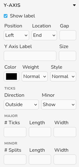
Position: choose where the axis label is placed relative to the chart. The available positions for y are left or right. These positions are defined with respect to the chart area.
Location: choose the label location along the axis at the selected position. The options are start, center, and end; in most cases, center is recommended.
Gap: set additional spacing between the axis label and the axis line.
Y Axis Label: set the y axis label using this box. You can use LaTeX formating for superscript and subcript using "_", "^", and "{}". You can also use greek alphabet using LaTeX formating (e.g. \alpha)
Size: set the font size of the y axis label using this box.
Color: customize the y axis label color using the color picker. The appearance of the color picker is defined by the browser. In Firefox, to select a custom color you need to click on the “+” icon.
Weight: customize the font weight using this dropdown. The options correspond to font-thin, font-extralight, font-light, font-normal, font-medium, font-semibold, font-bold, font-extrabold, and font-black, which map to 100, 200, 300, 400, 500, 600, 700, 800, and 900, respectively. Most fonts only provide a subset of these weights (typically normal and bold). You can see examples of fonts that support all weights in Google Fonts.
Style: customize the font style as normal or italic.
Ticks
Direction: choose whether the y-axis ticks point inside or outside the plot area.
Minor: turn minor ticks on or off using the dropdown menu (Show or Hide).
Major
# Ticks: set the number of major ticks shown on the y axis. The default value is 10.
Length: set the length of the major ticks (in pixels).
Width: set the width of the major ticks (in pixels).
Minor
For electronic band structure plots, minor tick styling is not available. When enabled, the following options control the minor ticks:
# Split: set the number of minor ticks between two major ticks on the y axis.
Length: set the length of the minor ticks (in pixels).
Width: set the width of the minor ticks (in pixels).
Legend #
The Legend panel controls the figure legends, including both the items and the text. If the simulation is spin polarized, a second set of legend settings is added to this panel. Use the Show legend checkbox to enable or disable the legend.

Loc X and Loc Y: adjust the position of the legend by modifying these two fields (in pixels).
Orientation: choose the orientation of the legend by selecting vertical or horizontal from this dropdown menu.
Length and Width: adjust the length and width of the legend items (in pixels).
Font size: select the font size of the legend text.
Border
Activate or deactivate the legend border by toggling the Show border checkbox. When the legend is hidden, the border options are disabled.
Color: customize the legend border color using the color picker. The appearance of the color picker is defined by the browser. In Firefox, to select a custom color you need to click on the “+” icon.
Width: customize the legend border line width by modifying this field. The units are pixels.
Radius: control the corner radius of the legend border box. If set to zero, the box will have sharp corners.
Legend label: use this field to assign a label to each legend item.
Color: customize the legend label color using the color picker. The appearance of the color picker is defined by the browser. In Firefox, to select a custom color you need to click on the “+” icon.
Weight: customize the font weight using this dropdown. The options correspond to font-thin, font-extralight, font-light, font-normal, font-medium, font-semibold, font-bold, font-extrabold, and font-black, which map to 100, 200, 300, 400, 500, 600, 700, 800, and 900, respectively. Most fonts only provide a subset of these weights (typically normal and bold). You can see examples of fonts that support all weights in Google Fonts.
Style: customize the font style as normal or italic.
Grid #
The Grid panel controls the major and minor grid lines along each axis. For both x and y, you can toggle major and minor grids independently.
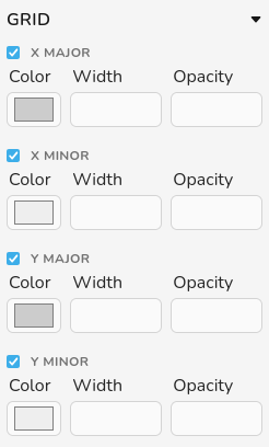
Color: customize the grid lines color using the color picker. The appearance of the color picker is defined by the browser. In Firefox, to select a custom color you need to click on the “+” icon.
Width: customize the grid lines line width by modifying this field. The units are pixels.
Opacity: set the opacity of grid lines to any value between 0 and 1, where 0 means fully transparent and 1 means fully opaque.